Improving Inbound Wire Transfer Process
UX Design Internship at SENTBE
My Contributions
Conducted heuristic evaluations and usability tests to uncover usability issues, informing design priorities
Built user personas and performed competitive analyses to guide improvements to the transfer process
Designed and iterated on wireframes to streamline the inbound money transfer flow for clarity and ease of use
Delivered final designs optimized for 13 languages, contributing to a 10% increase in app store ratings
My Role & Team
UX Designer (me)
1 Senior UX Designer
1 Product Manager
2 Developers
Timeline
May - July 2021 (6 weeks)
Product
Launched (WebView)
PROJECT CONTEXT
SENTBE’s inbound money transfer process
SENTBE is a financial technology start-up company that specializes in international remittances in approximately 50 countries and is rapidly expanding globally. SENTBE partners with over 40 global money transfer and payment services such as MoneyGram, Ripple, and Remitly to provide fast and secure cross-border remittance. In short, when someone sends money to South Korea through overseas partners, recipients can receive the transfer after verifying with SENTBE, which is an inbound money transfer process.
PROBLEM
Users have been raising issues about the inbound money transfer process
Several users have raised issues about the inbound money transfer process due to a lack of product awareness and an unintuitive user experience.
SOLUTION
Making inbound money transfer process more pleasant
Overview
Create an onboarding page to help users navigate the verification process and build trust
Refine UX writing to make it more comprehensible
Provide an intuitive progress bar to assist users with the procedure
Prioritize the content and features that will assist with the primary incoming money transfer process
HOW MIGHT WE
improve current inbound money transfer process?
DESIGN PROCESS
COLLECTING QUALITATIVE DATA
01.
Heuristic Evaluation
To begin my research, I did heuristic evaluation to identify usability issues with individual elements and to understand and define the project scope. I used Jakob Nielsen's Heuristics evaluation to identify issues.
Source: Nielsen, Jakob, and Rolf Molich. "Heuristic evaluation of user interfaces." Proceedings of the SIGCHI conference on Human factors in computing systems. 1990.
02.
Conducting usability tests
Based on user feedback collected, I conducted 3 quick usability tests with users to further investigate user pain points. The observation and follow-up questions covered their first impression of SENTBE, their behaviors during inbound transfers, what makes it easy or difficult, and what features they expect in the process.
KEY FINDINGS
According to Heuristic evaluation and usability testings, 3 main problem spaces were identified.
Problem Space #1.
Lack of product awareness
It has been discovered that users are distrustful of the process of sharing financial related privacy information since they do not feel secure and reliable owing to a lack of SENTBE brand awareness.
Problem Space #2.
Lack of visibility of system status
It currently lacks clear visual indicators, specifically an inaccurate progress bar and ambiguous status feedback, making it difficult for users to make decisions and stay informed about where they are in the process and what is going on.
Problem Space #3.
UX writing - Mismatches between the system and the real world
It has been noted that users have difficulty understanding the guideline texts due to system-oriented jargon and too much material presented on the user interface, which causes confusion during the process.
CREATING USER PERSONAS
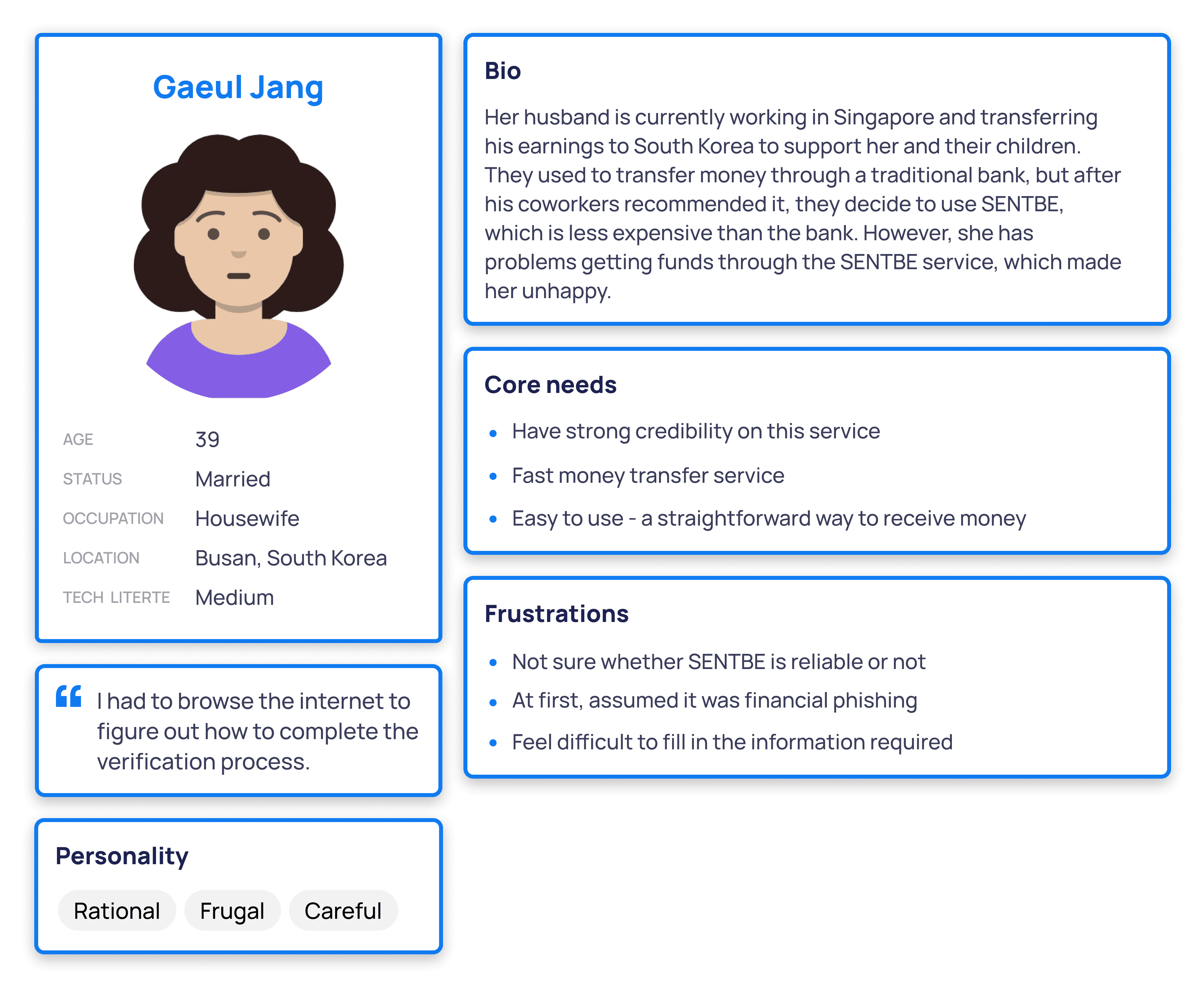
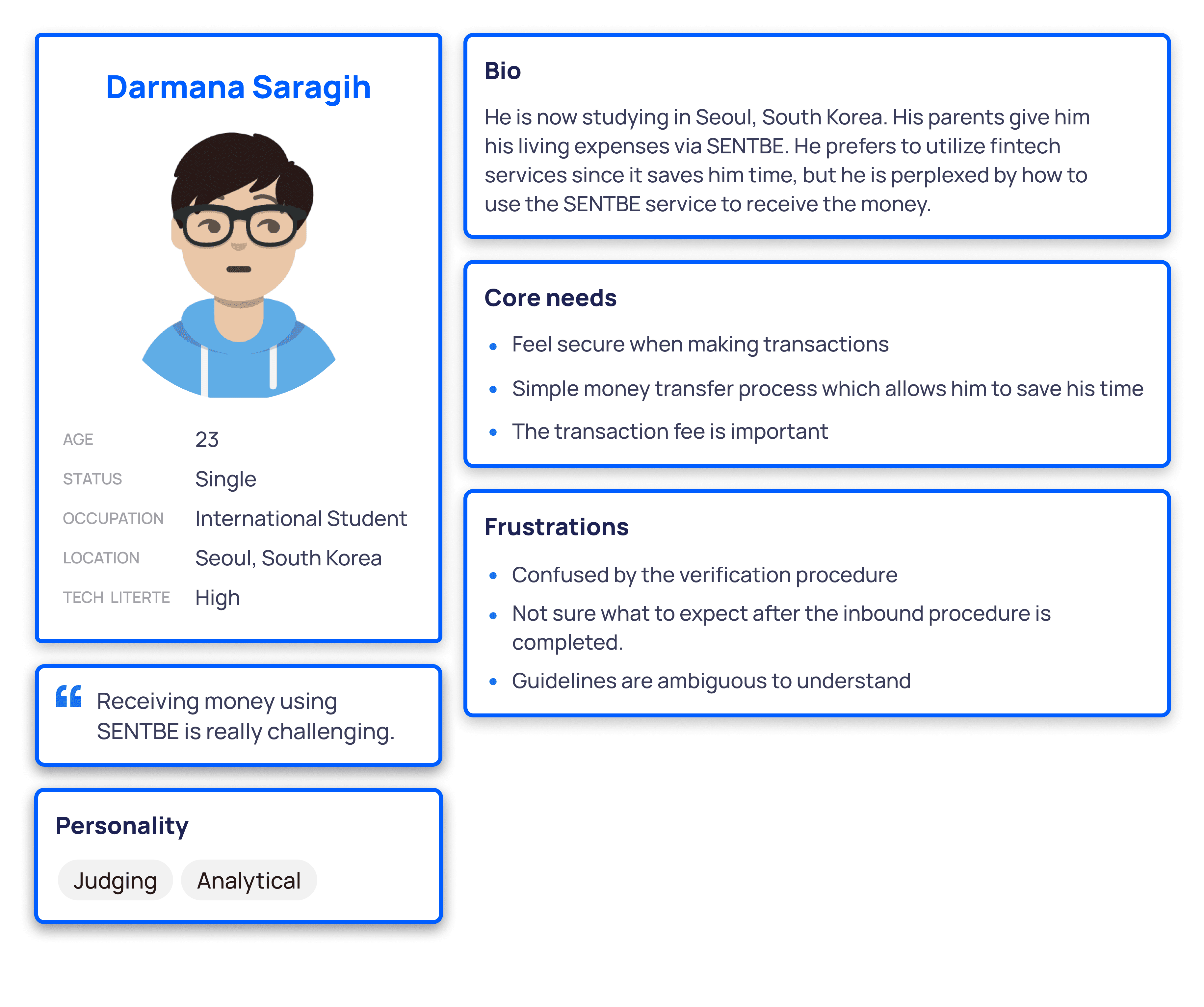
Focused and created two target user personas: Housewife and International Student
Following an evaluation of current user pain points, I created two user personas based on the target user group's goals and motivations for using the service. It also allowed us to focus on the target users during the design process.
COMPETITIVE ANALYSIS
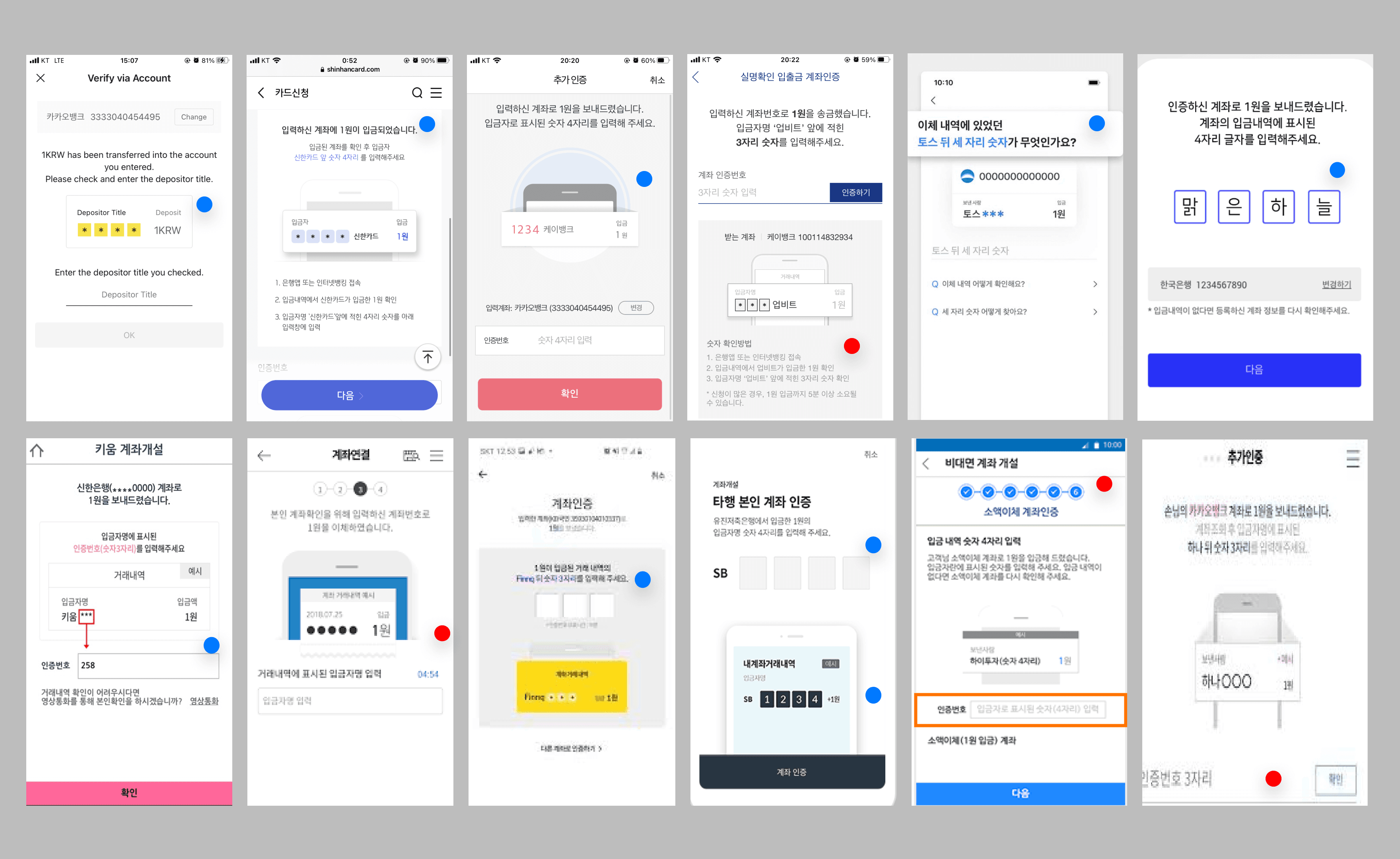
Many other services use specific guidelines with visual clues to direct this step
I conducted a competitive analysis of 12 other financial technology and banking services to gather the most recent trends, particularly in the penny drop verification process. Throughout this analysis, I observed that, since the penny drop test is a complicated process, many other services use specific guidelines with visual cues to direct this step.
BRAINSTORMING DESIGN REQUIREMENTS
In order to move on to the next design step, I synthesized our research findings into the main solution points:
Solution Point #1.
Ensure users feel secure with the SENTBE brand
Creating an on-boarding process that is intuitive and informative while also introducing users to the essential parts is to create successful first impression.
Be transparent what they can expect from SENTBE brand and clarify what personal information is going to be used for, and why it is necessary.
Solution Point #2.
Bring explicit visual cues
Make it easy to understand where the user is in the navigation flow.
Allow to predict how many steps are required to complete the inbound procedure to help user estimate the process.
Improve in providing clear feedback that confirms user action.
Solution Point #3.
Increase transparency in UX writing
Simplify and avoid complicated terms and jargons , and use language that are understandable to the users.
Arrange information in a natural and logical manner by displaying essential information without information overload.
Provide in-context guidance to bring clarity and consistency at the right moment.
EXPLORING DESIGN SOLUTIONS
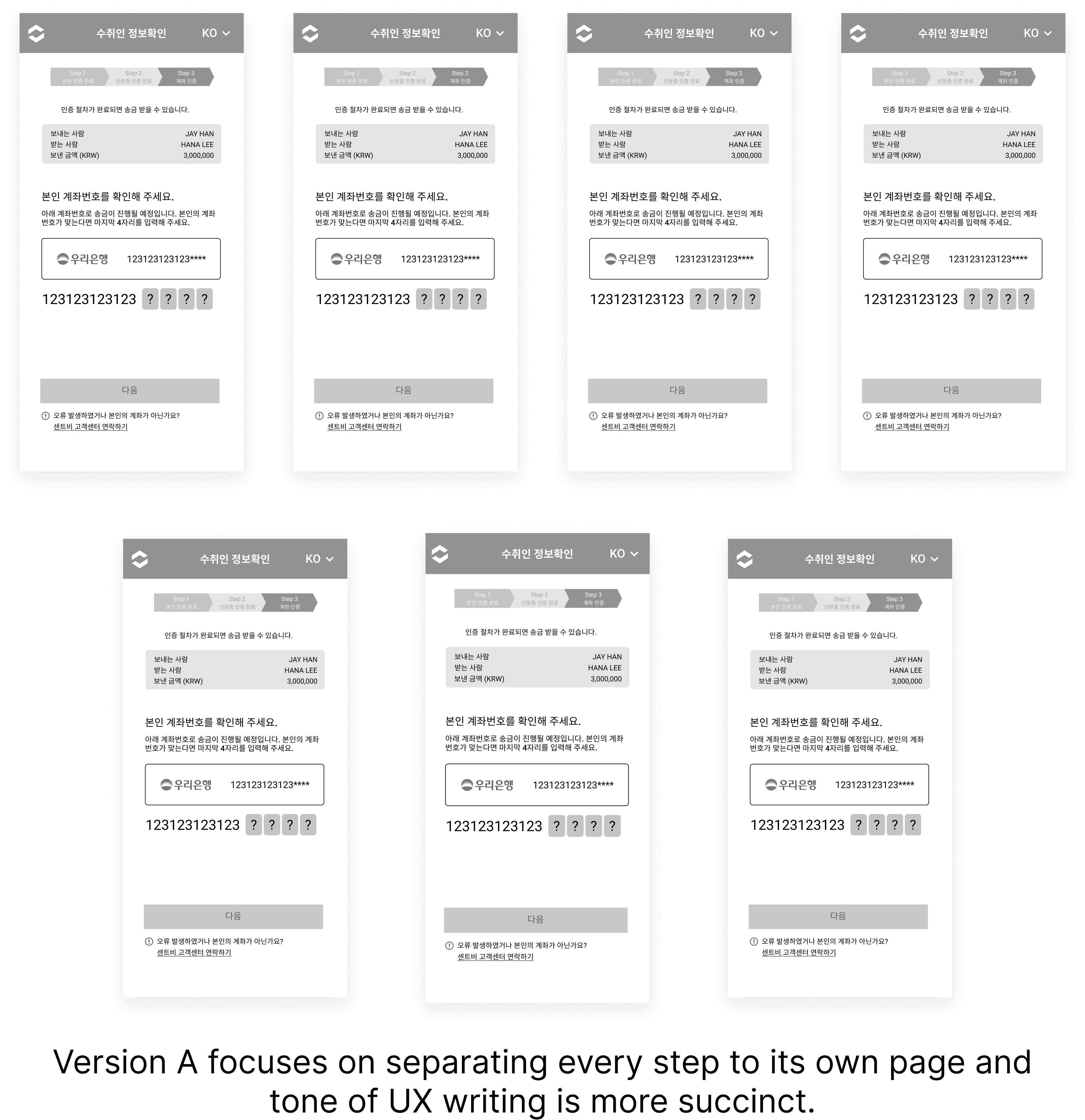
Conducting usability testing with Mid-Fidelity Wireframes
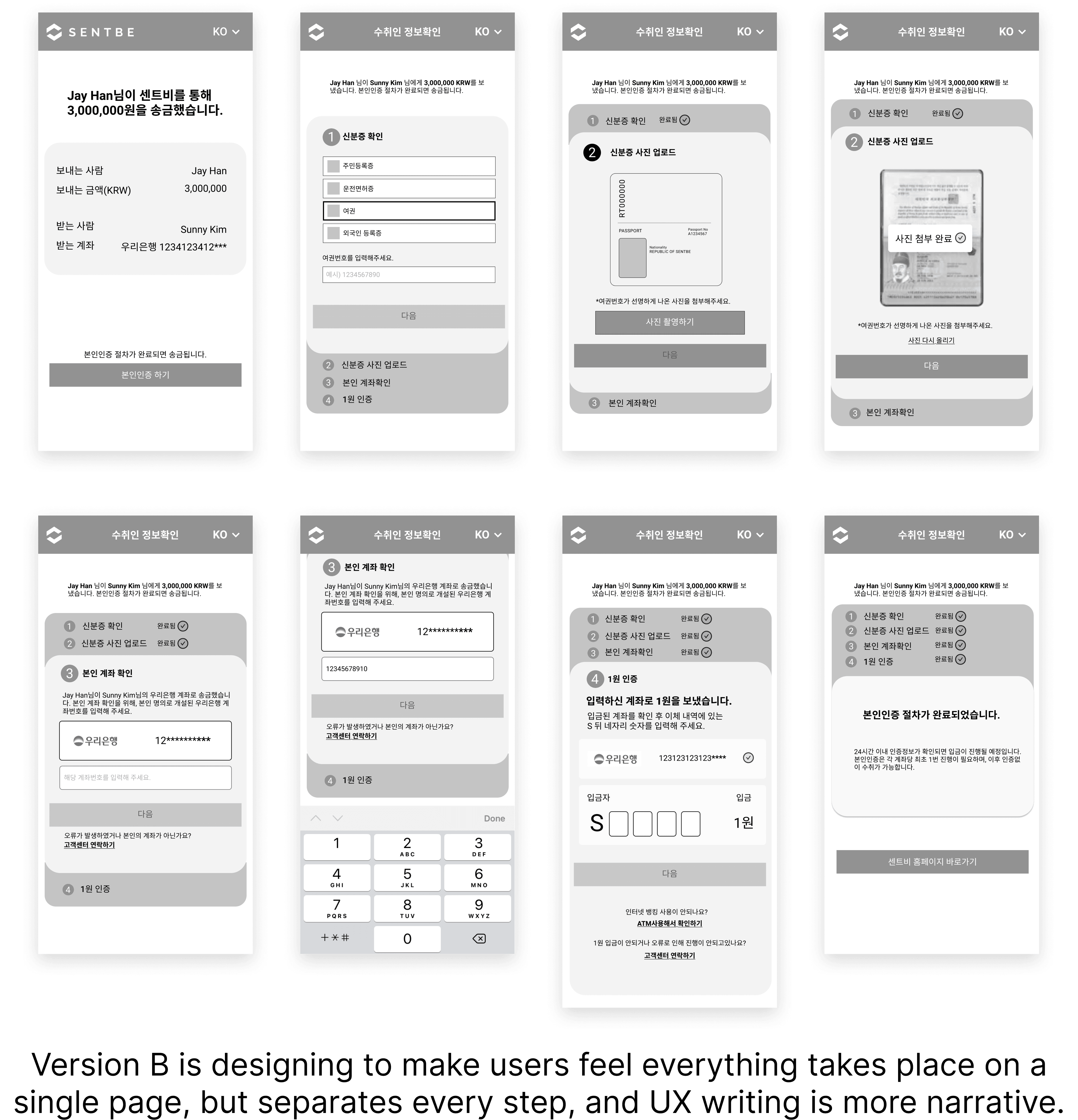
Through discussion with stakeholders, it was concluded that Version B gives users the impression that the process is shorter and easier to follow. In terms of tone and voice, Version A provides enough details in a succinct manner so that users are not overwhelmed by too much text on the interface. Thus, we decided to combine these two versions
UPDATING USER FLOW
User flow of the incoming transfer process, which includes client and server communication
While iterating with A/B versions, I also presented and delivered a user flow document at a stakeholder meeting, demonstrating an overview of the process and enabling for easy communication with developers and other stakeholders.
DELIVERING FINAL DESIGN
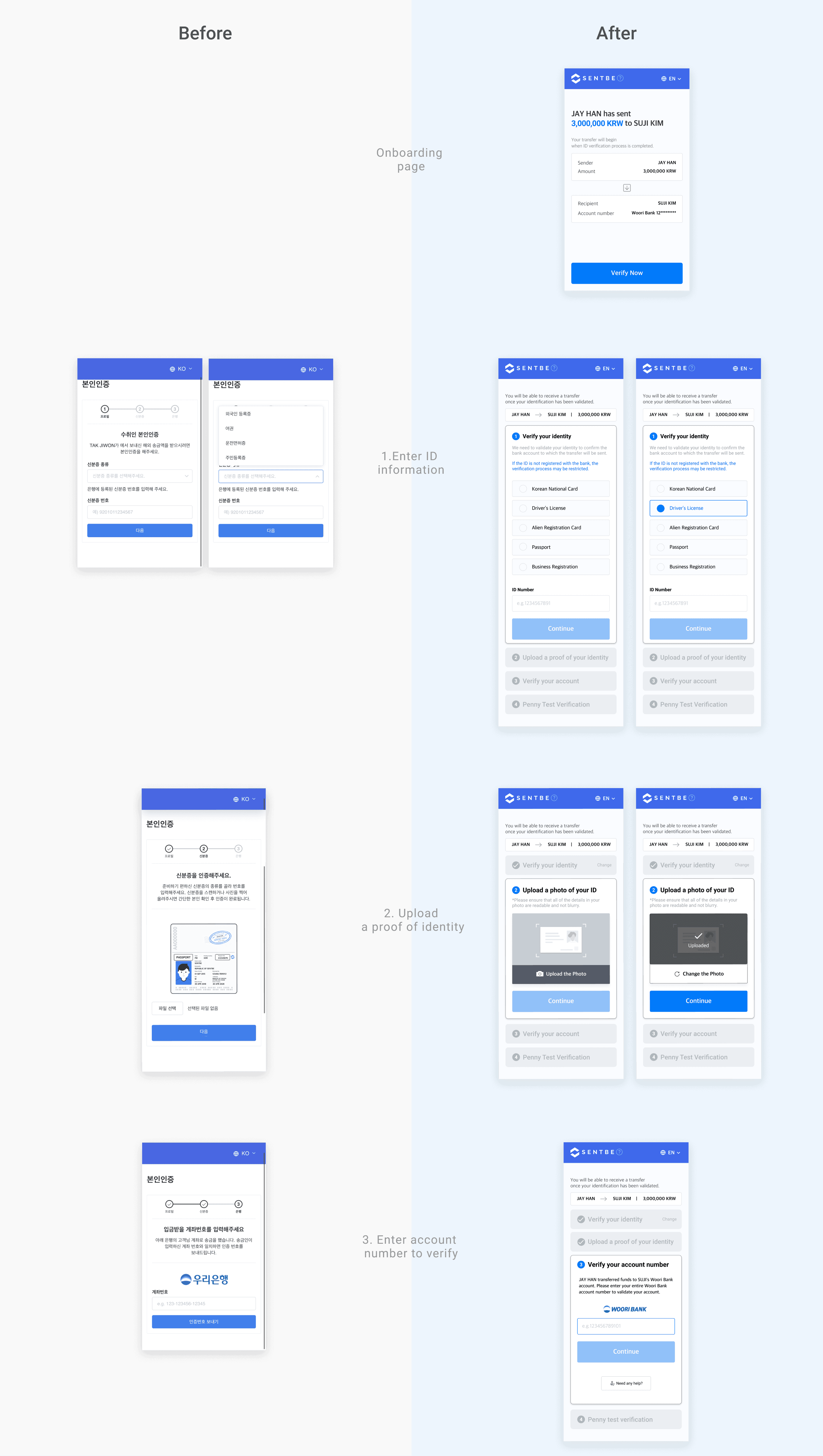
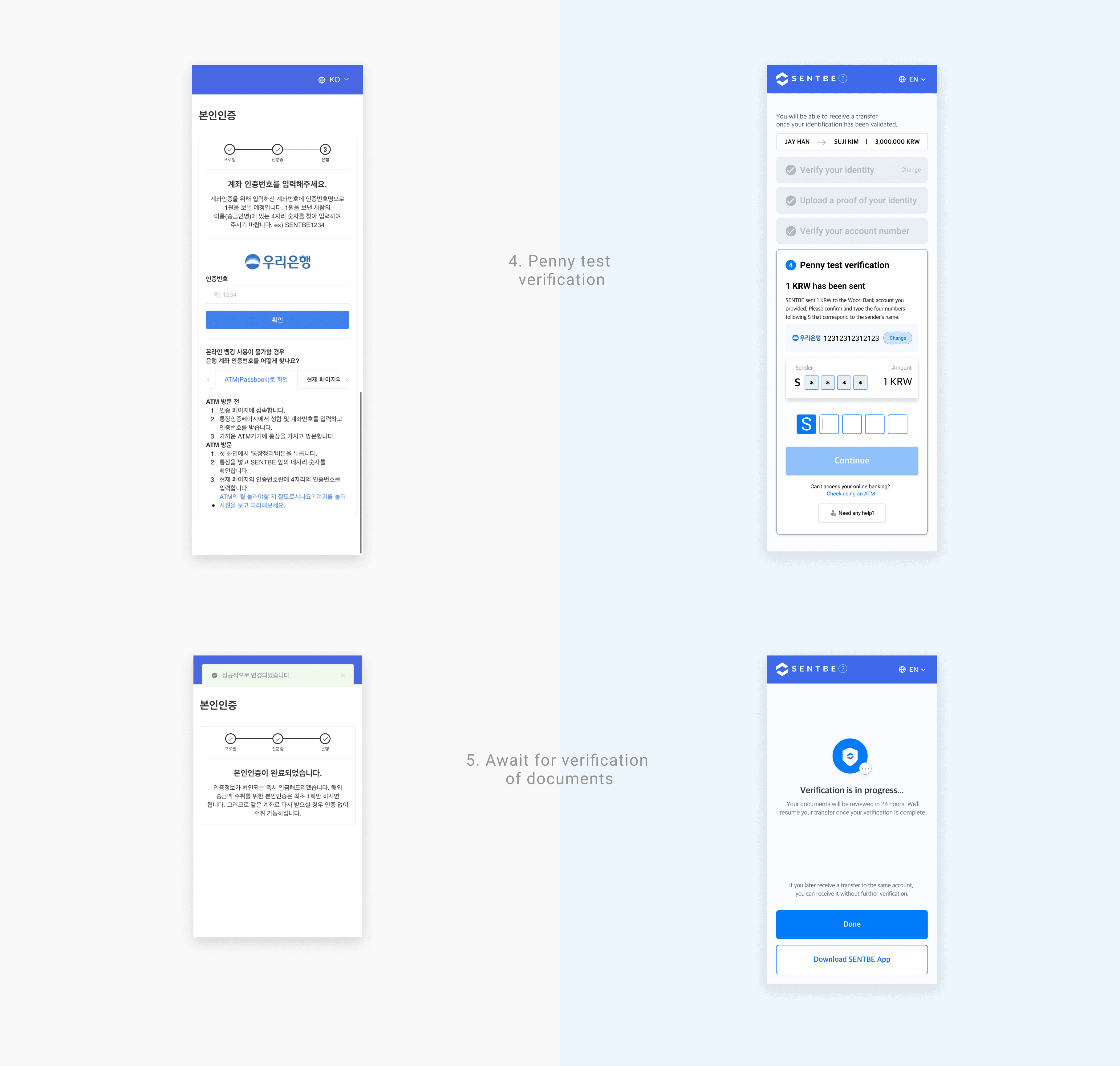
I delivered final design by compromising and incorporating feedback on Version A and B.
• Create an onboarding page to take users through the process without causing misunderstanding and to foster trust.
• Compose UX writing in a warm and understandable tone.
• Display a clear user interface to explain the current interaction.
• Provide a clear progress bar to assist them in guiding where to go next.
• Prioritize the content and features that will assist the primary function.
TAKEAWAYS
Learning to Communicate with Transparency
One of my big takeaways is that I have learned how to effectively and efficiently deliver my work and rationales in a more organized form to clearly communicate and get feedback from other perspectives. I was able to hone skills that allow me to create documents with task objectives, processes, and all details to assist developers in keeping the project within scope. In addition, holding casual meetings with front and back end developers on a regular basis provided me with useful feedback that allowed me to find better ways to help the development process run smoothly. Not to mention that it forced me to learn more programming jargon in order to communicate with them more effectively.
Having Global Users in Mind - Design for Multicultural Users
UX localization was far more important than I had anticipated. Understanding the cultural context is as important as linguistic translation. Leading multilingual quality assurance (QA) with translators several times has allowed me to become acquainted with a variety of users as well as technical considerations such as how to adapt layout to text requirements in order to create a user experience that is specifically designed for a language and culture by optimizing design for 13 different languages and understanding different levels of digital literacy.
Working in a Startup Environment
By working in a startup environment which is fast-paced, I had to handle multiple tasks at a time and allow me to practice prioritizing tasks by monitoring and reporting issues within the current release of SENTBE application and web. Moreover, I participated in various project meetings over time from kick off to closing ,which gave me invaluable chances to freely exchange my ideas and thoughts in front of stakeholders, product designers and CTO, as well as marketing department which allowed me to gain deeper insights of the product, but also improve the task process.
TESTIMONIALS
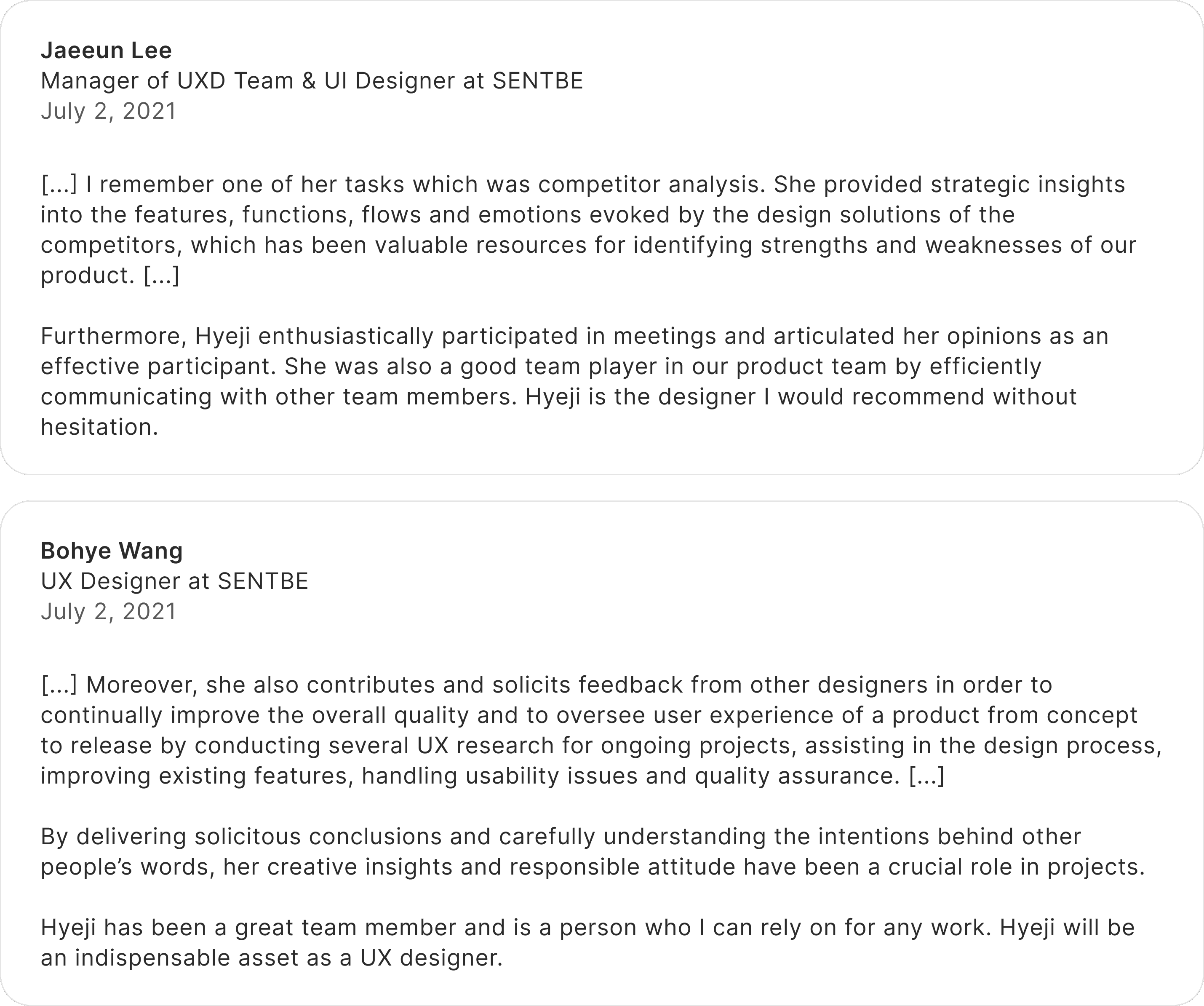
Last day of my internship - Thanks to UXD & Product team ✨


