Master Rain Gardner Site User Testing
Rapid User Testing Project as part of Civic User Testing Group
My Role
Project Manager & UX Researcher
Timeline
Oct - Nov 2022 (4 weeks)
Project Type
UX Research Project
PROJECT CONTEXT
This UX research project was conducted in collaboration with Washtenaw County, Michigan, and Friends of the Rouge to evaluate the Clean Water Project Tracking website, 'Soak It Up!'
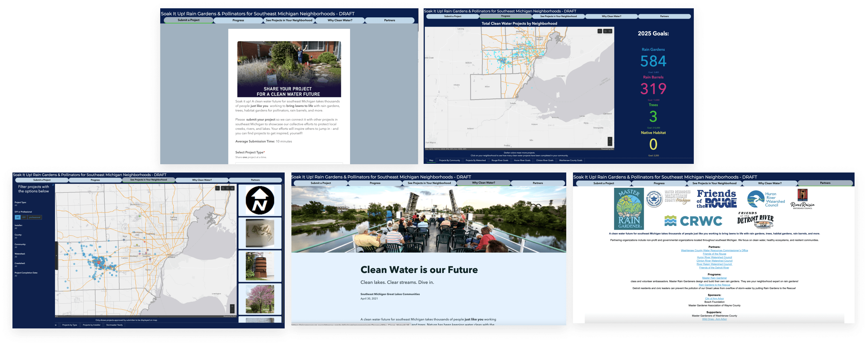
Overview of "Soak It Up!" Website
PROBLEM
Rain gardners need a clear, easy-to-use tool to input information about their rain gardens so that Washtenaw county can track and map them. It's important for this website to be clear but also foster a real, personal relationship with gardeners.
RESEARCH OBJECTIVES
Gauge rain gardeners ability to easily input project information and use the site
Understand motivations for creating and comfort with sharing rain garden projects
Evaluate user engagement and interest in learning more about the rain garden program
KEY FINDINGS FROM RESEARCH
Navigating the website
Users have difficulty navigating the website as users expect the site to follow typical site structure and include a homepage that orients them
Sharing projects
Users need more clear guidance and flexibility when sharing a project
Engaging with the community
- Users like to share their rain garden projects in their community, which can be aided by information transparency
RESEARCH PROCESS

PROTOCOL DEVELOPMENT
Based on our discussion with the client, we came up with a user testing protocol including series of tasks to test.
01.
Pre-Task Questions
Understand background, experiences, and interests of participants in relation to rain gardens
02.
Tasks
Participants interact with features of the site to understand if interactions align with intended goals
03.
Post-Task Questions
Follow up with participants about the site to understand their opinions, what went well, and potential areas of improvement
DEVELOPING TASK AND END GOALS
01.
Submit a Rain Garden Project
Can uses successfully submit a rain garden project?
Can users accurately locate their rain gardens on the map?
02.
Identify project types on map
Can users interpret map legend correctly to identify the two projects in Ypsilanti?
03.
Identify high density rain garden areas
Can users find the most rain garden areas on the "progress" page or "see projects"?
Can users locate and understand legend information on the map?
04.
Return to submission page
Can users navigate back to the main page?
Can users submit a different type of project from rain gardens?
05.
Find nearby projects
Can users find a rain garden near their home using the map?
06.
Interpret Progress tab data
Can users understand goals displayed on the Progress page?

USER TESTING
To meet the objectives, user testing of the "Soak It Up" website was completed :
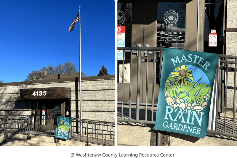
11 rain gardners from Washtenaw county in 30-minute interviews (4 in-person and 7 online Zoom sessions)
Participants asked to complete 4 main tasks and 2 secondary tasks related to site navigation and project submission
Assessing if site is effective as a means of project tracking and community engagement
DATA ANALYSIS: AFFINITY DIAGRAM
After conducting user testing with 11 rain gardeners, I led an interpretation session to organize our interview notes and uncover insights by utilizing Miro board based on user testing results.
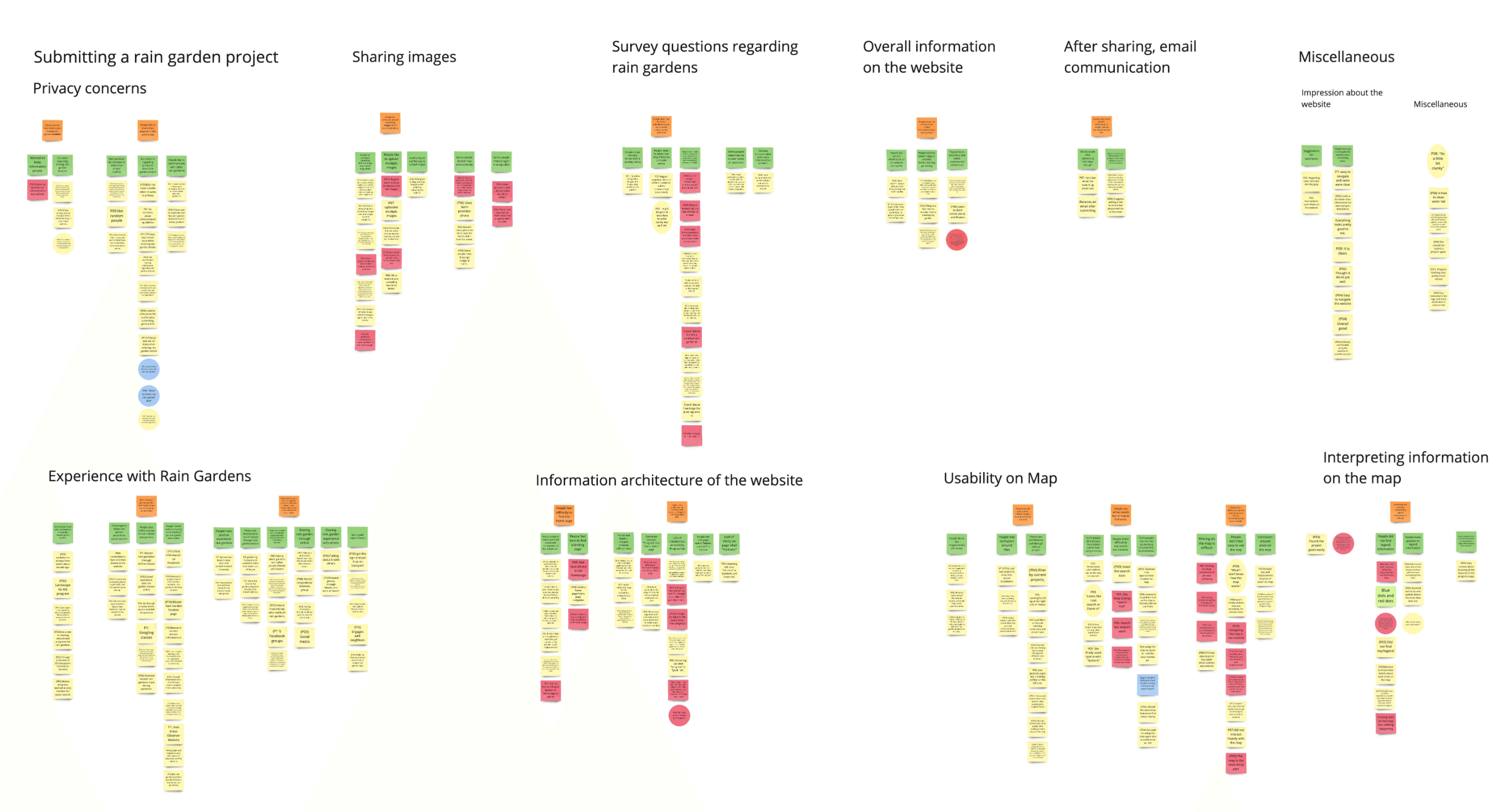
During the process, we utilized different colors and shapes of sticky notes to distinguish:
- User pain points: pink sticky notes
- User delights: blue sticky notes
- User quotes: circle sticky notes
It allows us to see heatmap result as the topic appears to be the most "pink," indicating that it causes more user pain points.
USER TESTING FINDINGS
By building affinity diagram, we were able to identify user pain points and insights. After that, by going over group discussion, we also provided actionable recommendations to the clients.
1. Navigating the website
🔴 Finding 1.1 The site's lack of homepage disorients users.
Current landing page is "Submit a Project," which frequently falls short of user expectations and experience.
— "Not sure where is the homepage?A homepage can offer a clear starting point by introducing main tasks and site's purpose.
— "Would prefer a welcome screen. Initially would submit a project but future visits would be looking to connect.
✅ Recommendation 1.1
Add a designated landing page with clear return navigation to establish user’s “home base”
Landing page which include introduction and purpose of the website such as community rain garden photos
🔴 Finding 1.2 Users find it difficult to navigate back to initial page of submitting a project
Users must refresh their browser to navigate back to the form to submit another project
- Moving back to Submit a Project again was difficult as the user had to be prompted to reload the website.
- Had to refresh the page for the completion message to go away
✅ Recommendation 1.2
Ensure users are able to return to the “submit a project” form through intuitive actions like hitting the back button or re-selecting the form tab
Add a clear call-to-action button (e.g., “submit another project” ) directing users to submit another project

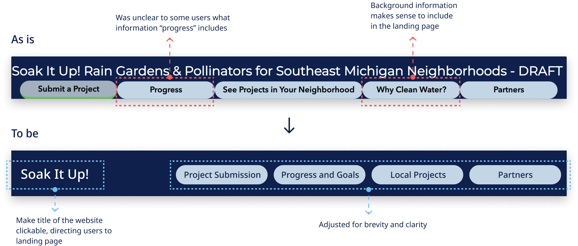
🔴 Finding 1.3 Navigation labels do not match user expectations
Navigation labels do not clearly communicate with users to help predict the functionality and content of pages.
User thought that "Progress" meant rain gardens in progress. It was not intuitive that goals would be found under "Progress"
—“Not sure about the difference between Progress and See Projects page”
✅ Recommendation 1.3
Alter navigation tab labels to more intuitively represent page content
2. Sharing Projects
🔴 Finding 2.1 Users had difficulty answering technical questions
Users paused and asked for directions on how to complete more complex questions like area calculation and the expert-level details section.
User liked the expert section because it allowed for more information, but suggested having links to resources for these questions, and calculating surface area would help in answering them.
✅ Recommendation 2.1
Ensure form questions are clear using consistent wording, order, and spacing to maximize comprehension
Offer explanation of technical terms, links to explanatory resources, and tools to facilitate area calculations

🔴 Finding 2.2 Users want more flexibility in form options
Users wanted to submit more than one 'before photo.'
Some users did not get run-off from any of the sources listed and wanted an Others option
—“I don’t get run-off from any of these!”Some said they wanted multi-select options for the question on what existed before they created the rain garden
—“Why can’t I select more than one?”
✅ Recommendations 2.2
Provide clear instructions and structure in the photo submission area
Match question type with answer selection method allowing users to enter all applicable options
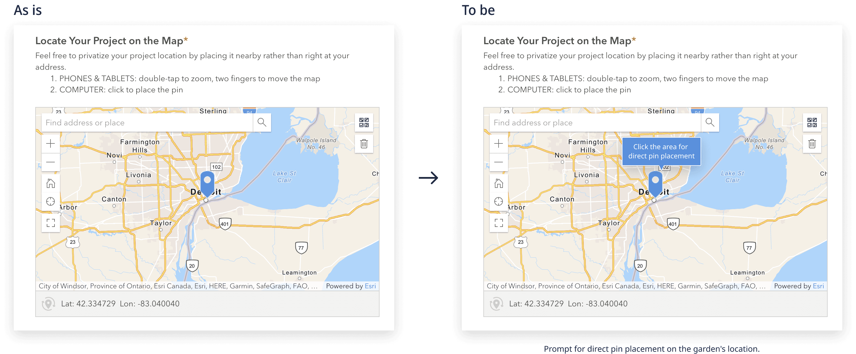
🔴 Finding 2.3 Users did not find the map intuitive to use
Most users expected to move the pin on the map by dragging and dropping it but this functionality is not available
It took users some work or a nudge from the interviewers to click on the area it should go to
—“The map is not intuitive for me at all.”
—“What? I don't know how this map works."
✅ Recommendation 2.3
Use a drag and drop pin to create a more intuitive map experience for users
Prompt for direct pin placement on the location of the garden itself
3. Engaging with the community
🔴 Finding 3.1 Users want to share the work they’ve done with the community
Facebook is the primary connection method between gardeners
— “I shared the pics in the Master Rain Gardener Facebook Group.”
— “I would go to Facebook Group to seek some helps or ask Susan.”
✅ Recommendation 3.1
Promote the site on Facebook and other rain gardening platforms where sharing is already happening
🔴 Finding 3.2 Users who do have privacy concerns are more willing to share their rain garden experience with only friends and other community members
Some users do have privacy concerns when sharing their gardens’ addresses out
— “Is it possible to put your project on the map but not add an exact location, more general?"Communicating who can access info and why it is needed can alleviate users concerns
— “Prefer having an email regarding concerns around privacy”Recommendations 3.2Offer details about information privacy and usage where users share address details and through the submission confirmation email
✅ Recommendation 3.2
Offer details about information privacy and usage where users share address details and through the submission confirmation email
🔴 Finding 3.3 Users found filters confusing for finding the projects close to their communities
Using filters/search function was challenging for some users when looking for nearby projects
— “How can I remove [the filter]?”
— “What should I choose for ‘County’ and ‘Community’?”
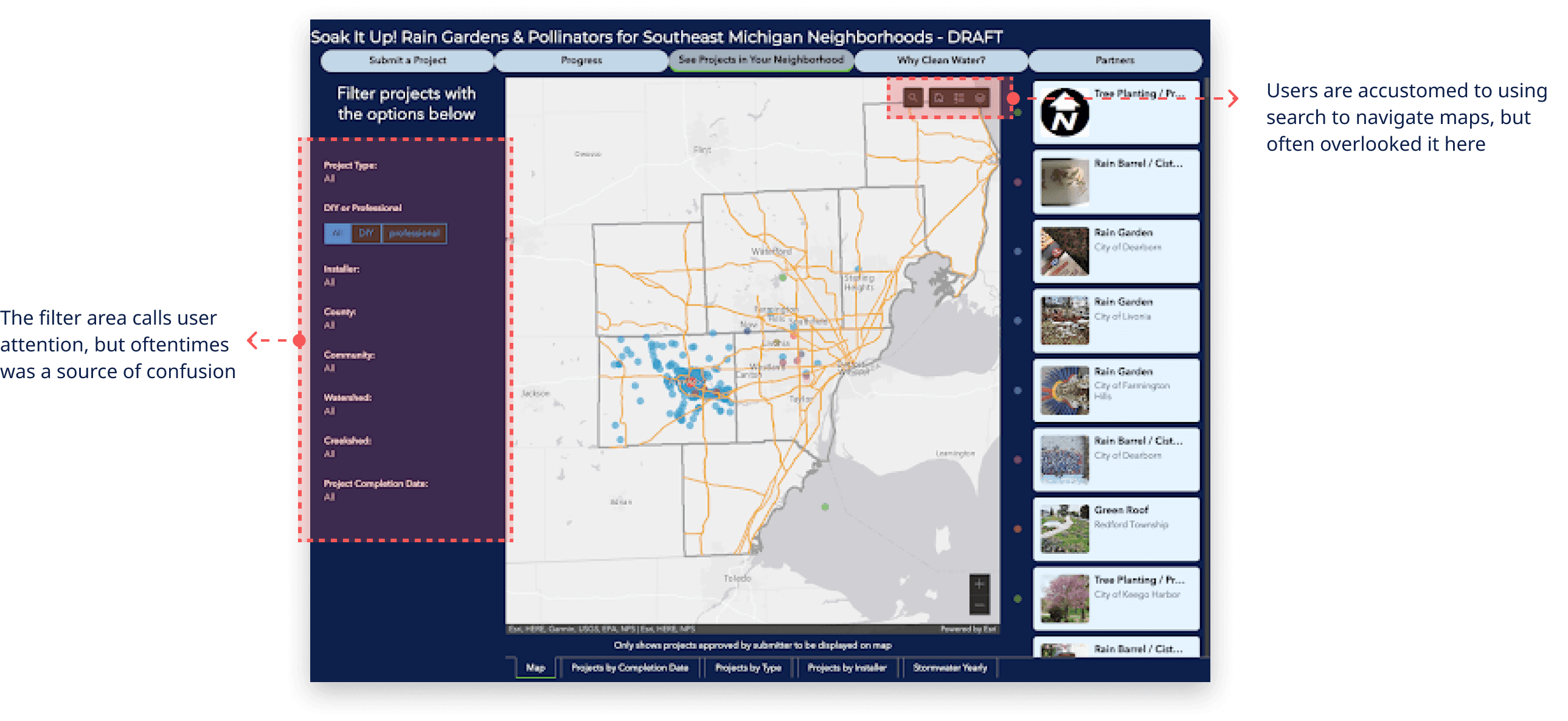
✅ Recommendation 3.3
Standardize map navigation to coincide with user previous experience
Increase the visibility of the search bar and reduce the space occupied by filters
🔴 Finding 3.4 Users see value in the site and its potential to foster community engagement
Users would like to see more useful information about rain gardens.
— “It would be interesting to see some plant species information- what are other rain gardeners planting, along with filters such as edible, trees, fruits, etc.”Users would be interested in using the site to be able to engage and connect directly with other rain gardeners
— “It would be nice if there was a messaging function to communicate with other gardeners.”
✅ Recommendation 3.4
Expand site functionality beyond project submission to include opportunities to connect socially and share information with community members
IMPACT
Civic User Testing Group (CUTgroup at UMSI) projects are designed to be short and fast-paced in order to make public applications more accessible, valuable, and useful for residents. Despite the fact that we only had about 4 weeks on this project, as Cutgroup's slogan "Don't let the perfect be the enemy of the good," our group was successful in delivering small improvements that had a big impact on the community.
Here is what clients said after the final presentation.
"Thanks to the whole team for such a thoughtful and helpful report! Your synthesized findings will be put to use! Listening to the live testing was also invaluable. I picked up on many small details that we could tweak wording, and make small changes to improve the experience and provide clarity. Ultimately, this helps us improve the site. And it also gives us guidance about how ready we are to make it "live." Thank you! "
— Client A
"Thank you all so much for all your hard work. I found your feedback last week to be incredibly helpful, and highly actionable. I’m looking forward to working to get this closer to final (usable) form."
— Client B
TAKEAWAYS
Facilitating group meetings to keep our project on track
As the project manager in a team of 5 students, I facilitated weekly group meeting by setting up an agenda. This required clear communication with teammates, program coordinators, and clients. Most importantly, I learned the value of having pilot user testing session with teammates to practice prior to the user testing session. This allowed all of our teammates to ensure that the end goals of each user testing task, as well as the caveats to remember for user testing sessions.
Being flexible during User Testings
Based on our client's meeting, we were able to brainstorm several user testing tasks, and we prioritized some of them based on following discussion with clients, as well as, by making sure with research objectives. Having primary and secondary user testing tasks allows us to be more flexible during user testing. Furthermore, for each user testing session, we were only given 30 minutes to complete 4 main tasks and 2 secondary tasks, including pre- and post-test questionnaires. However, we discovered that the most of participants spent the majority of their time on Tasks 1 and 2. Thus, for the second half of our testing, we switched the order of user tasks and prioritized the remaining tasks to ensure that we covered everything we planned to get enough data. Not to mentioned that, this allowed me to learn never to assume users before testing.
