Streamlining the Patient Onboarding Process
Redesigned the flow, boosting completion by 37%
My Contributions
Spearheaded the redesign of the patient onboarding flow, increasing completion by 37%.
Partnered with stakeholders to align user needs with business goals and prioritize key features.
Audited the existing experience and analyzed drop-off data to identify friction points and improvement opportunities.
Designed new user flows with direct scheduling, provider matching, and profile browsing to streamline onboarding.
Led usability testing with patients and providers, iterating on the design based on feedback.
My Role & Team
Solo UI/UX Designer (me)
1 CEO, 1 CMO, 1 CTO
1 Project Manager
2 Developers
Timeline
Jun - Dec 2023, Launched in 2024
Product
Responsive Web Design
(Desktop & Mobile)
CONTEXT
About MovementX
MovementX is a healthcare startup that helps patients connect with licensed physical therapists and book personalized care sessions.
To book their first session, new patients go through an onboarding flow where they create an account and submit a request for care.

PROBLEMS ON THE SURFACE
Many new patients struggled during the onboarding process, leading to a 15% drop-off after sign-up and never booked their first session.
This meant patients experiencing pain were stuck waiting, and the business was losing meaningful number of potential patients. — Keaton, CEO & COO at MovementX

THE CHALLENGE
How might we streamline the onboarding process so new patients can quickly schedule their first session?
RESEARCH METHODS
To uncover why new patients were dropping off after sign-up, I conducted a heuristic evaluation, analyzed onboarding analytics, and interviewed customer support staff to understand user pain points.
PERSONA
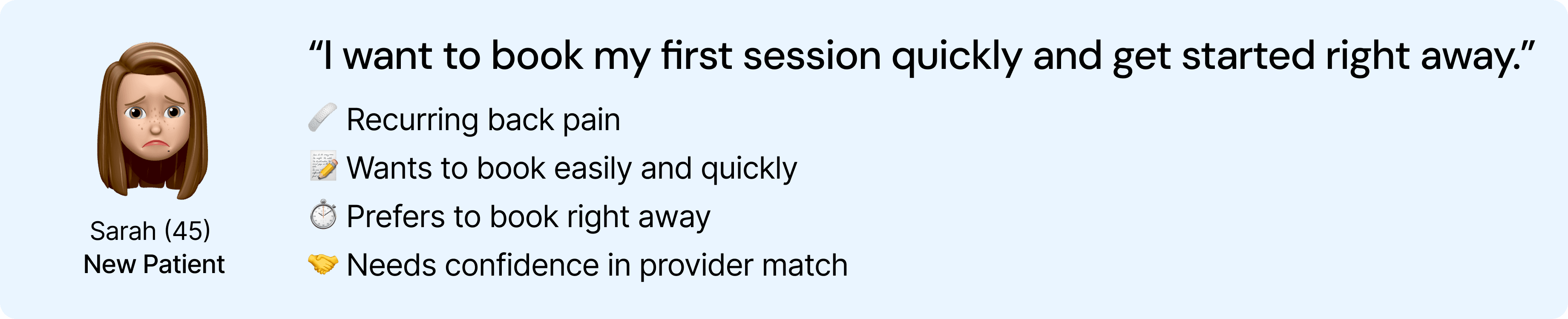
The research allowed me to understand patient pain points during onboarding experience. From these insights, I identified Sarah as the primary persona, representing the largest user group. It allows me to synthesize insights through the lens of users, ensuring design decisions reflected real needs and motivations.
So, what problems did users face?
KEY PAIN POINTS
Insight 1. Free-text fields put the burden on users to explain their needs
When Sarah began the onboarding process, she encountered several open-ended questions. She wasn’t sure what to write or how much detail to include, which slowed her down and made the process feel heavier than it needed to be. The onboarding experience should feel quick and guided, but instead it placed the cognitive burden on the patient.

Insight 2. Payment step created confusion and hesitation
After completing the intake questions, Sarah was asked to enter her payment information before seeing or selecting any provider. Because she didn’t yet know who she would be matched with, this step felt risky and created hesitation. This reduced trust at a critical moment in the journey.

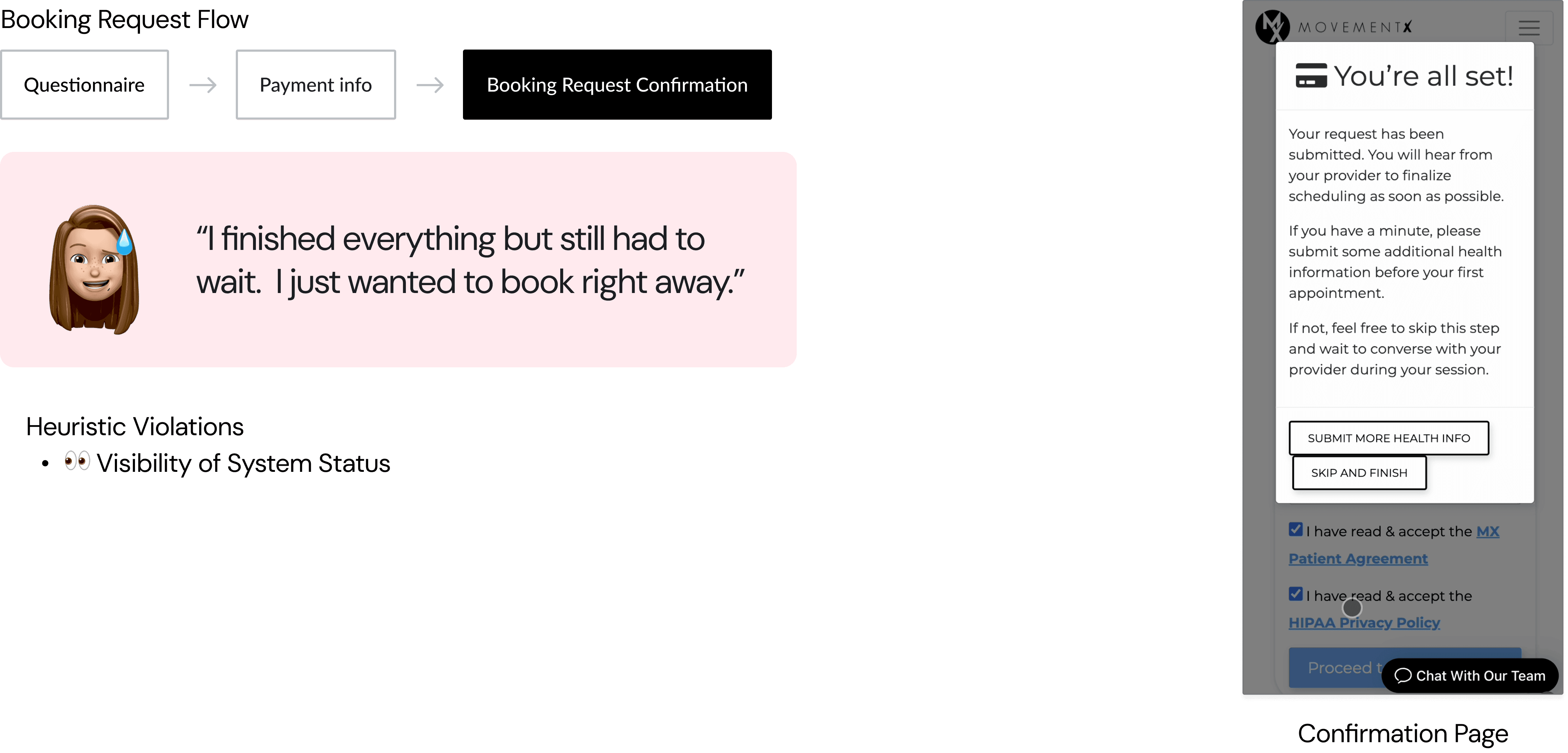
Insight 3. No instant booking available
Even after submitting her request, she had to wait for a provider to contact her, without knowing when that would happen. This uncertainty, especially after sharing so much personal information, left users frustrated and led many to leave before ever booking their first session.
Okay, problem identified. Time to brainstorm ideas💭.
DESIGN GOALS
From there, I defined 3 key design goals.
DESIGN CONCEPT
Exploring Design Concepts: From Simple to Smart
With these goals in mind, I reviewed onboarding patterns across other health tech platforms and explored three directions from simple usability improvements to more intelligent automation. Throughout this process, I evaluated each concept based on user clarity, development feasibility, and business impact.

⤵️ Why We Chose AI-Powered Provider Matching
Search and chatbot concepts either required too much effort from patients or were slow to scale. The provider-matching approach offered the best balance: it gave patients personalized recommendations quickly and enabled instant booking instead of waiting. It also required only moderate engineering effort using existing provider data, making it both impactful and feasible.

Bring ideas to life.
ITERATIONS
Validating and Refining Through User Testing
Once we aligned on the provider-matching direction, stakeholders had differing opinions about the question order and what information should be collected upfront. To move beyond assumptions and personal preferences, I led user testing with five new patients to validate the flow.
Key Insight: Patients needed clarity and confidence before commitment.
What Changed - Symptom questions moved earlier, Referral questions moved later, Booking summary shown before payment
FINAL DESIGN
Design Goal 1.
Faster & Easier Onboarding
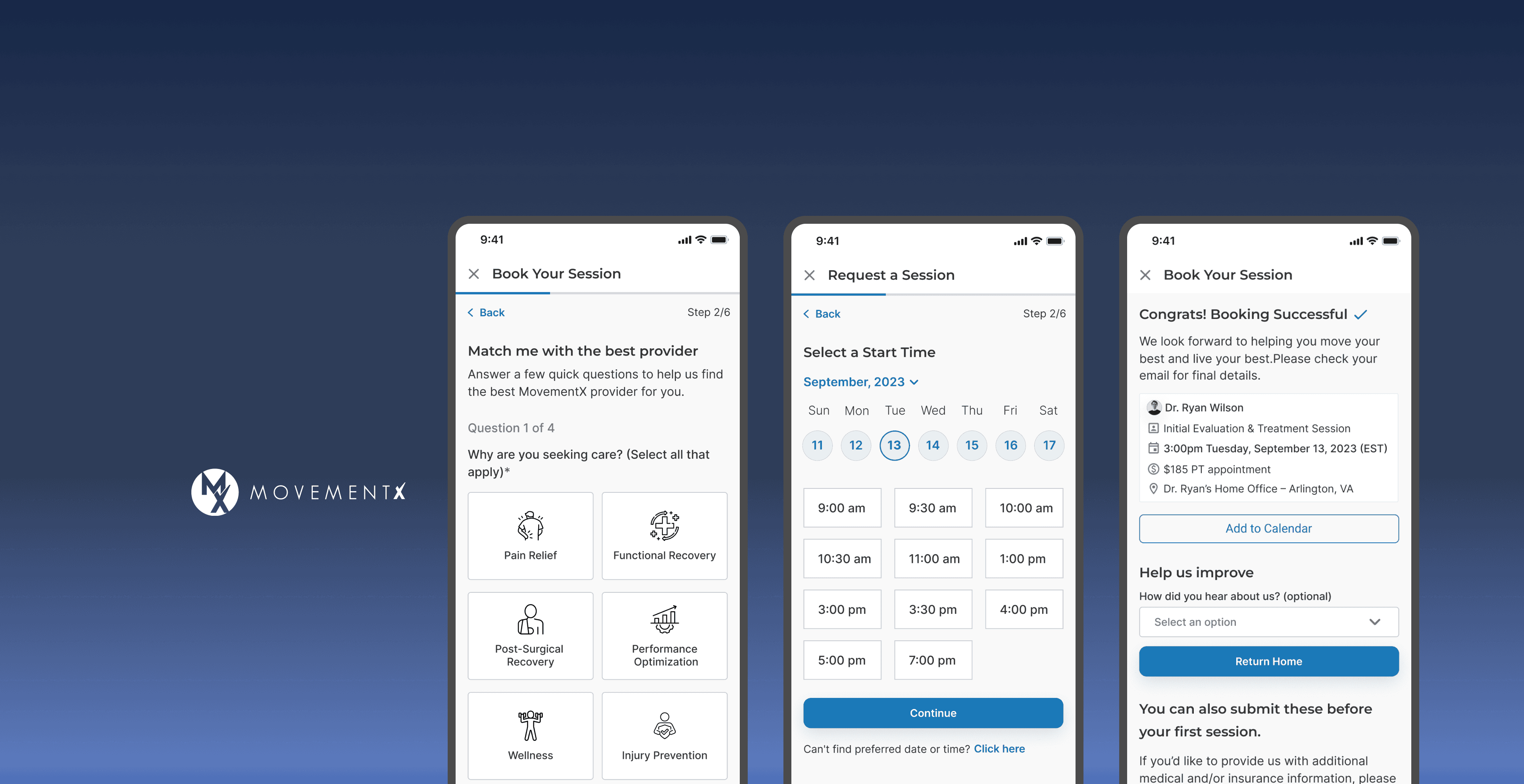
The long, free-text form was replaced with step-by-step guided screens.
Patients now answer multiple-choice, tap-to-select questions instead of typing, reducing effort and cognitive load.
Design Goal 2.
Build trust before payment
Patients first receive personalized provider recommendations and can view provider profiles before entering payment details.
This gives them trust in who they’ll be working with before committing.
Design Goal 3.
Instant Booking
Instead of waiting for a provider to reach out, patients can now select a session type, date, and time directly in the flow.
This enables immediate booking, capturing users at the moment they’re most motivated to start care.
DESIGN CONSIDERTATION
Accessibility
Adhering to WCAG standards
Readable text size
Large touch target
Strong color contrast
Clear progress indicator

MY TAKEAWAYS
User feedback aligns teams and decisions.
As the only designer, I often navigated differing stakeholder opinions. Leading user testing helped shift conversations from personal preference to real user behavior, which created alignment and confidence in the final solution.
Building a reusable design system kept development efficient and consistent.
To maintain consistency and support a responsive design, I built a design system with reusable components that adapt easily across screen sizes. This not only simplified the transition to responsive layouts but also improved development efficiency by 60%.

TESTIMONIALS
“Hyeji absolutely transformed our health tech application. She was communicative, creative, and consistently met deadlines. Every team member from our CEO to developers loved working with her, and any company who hires her will see a clear ROI.”
